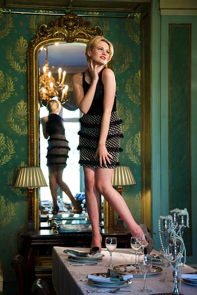
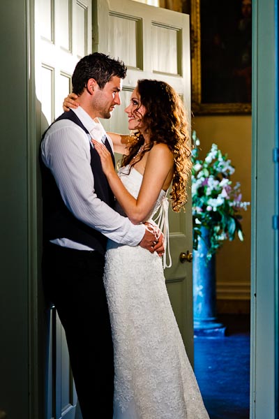
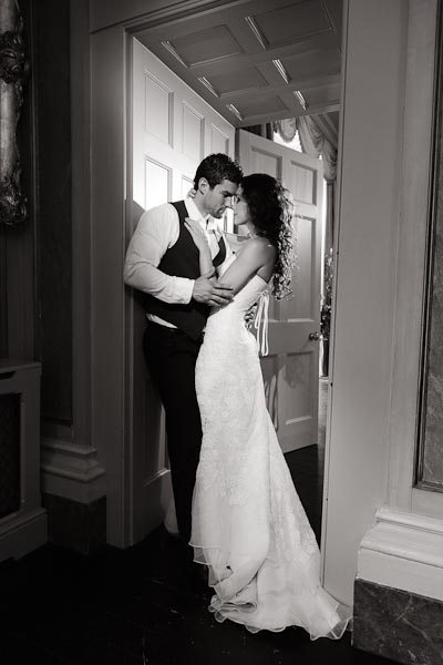
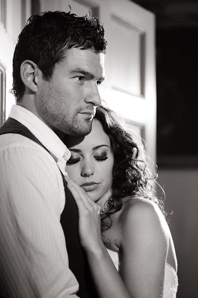
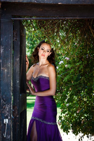
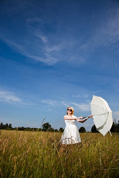
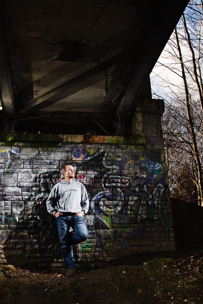
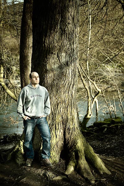
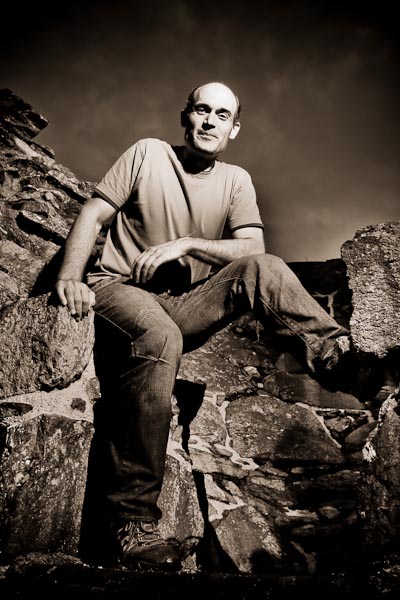
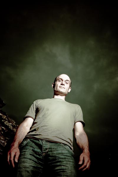
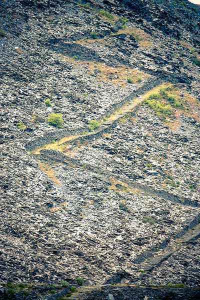
One of the problems I’ve encountered in post-production with my images is imagining how they can look unique? I want some of them to be different, but give a familiarity and look that provides an alternative to the actual scene in real life. My earlier attempts in post-production were pretty basic and it remained so for a long time. Slight adjustments to exposure, brightness, contrast, colour, etc… My main problem was that I couldn’t imagine how the photograph could even look different? I guess I was conditioned by the scene when taking the photo, then further conditioned when chimping on the image on the back of the camera, and again conditioned when I saw the image on the computer. I had seen the scene and image so many times, I couldn’t possibly imagine how else the image could look?
So as a tool to help me imagine things differently, I used Lightroom presets. Lightroom comes with a few presets, but I needed much more serious help in looking at these images differently. Initially I used a whole bunch of presets by Matt Kloskowski (link). This helped a lot until I found the Wonderland Presets (link).
I have been using the Wonderland presets as a tool to help me gain a new perspective. I don’t always use these presets in the final image, but from time to time, I stick with a look that I think works. If I do use a preset, I use the preset as a basis to build on and I make further adjustments to get to the image I want.
However, after being on Damien Lovegrove’s session with his picture editor, Marko (link), I’ve gained a whole new perspective on post-production and I’ll be using the Wonderland presets less and less. Amongst the many things I gained from Marko, colour accuracy (or at least believable colour) in skin tones is highly important. This may seem obvious… but seeing the way that Marko works was a technique I’d not come across before. Using presets like the Wonderland series does mess with the colours of skin tones which is why I will be adopting Marko’s approach more and more…
Okay… lets go through the images…

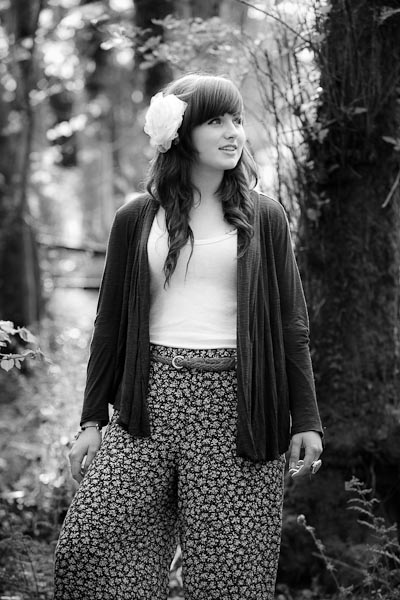
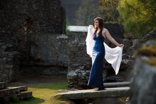
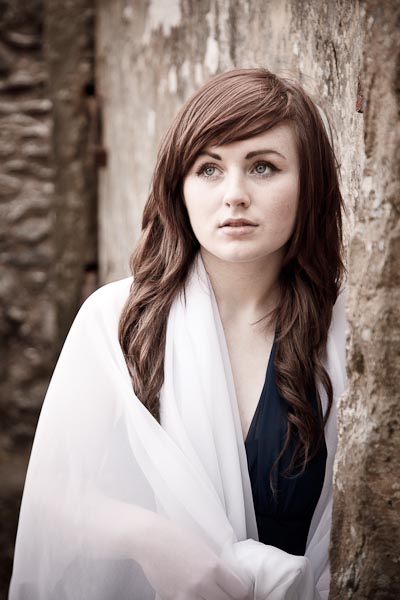
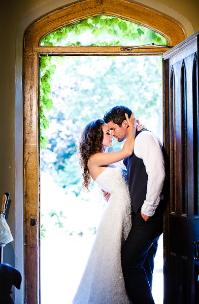
Wonderland: Creative Catalyst 08, ISO 200, 32mm, 1/250 sec, F7.1.

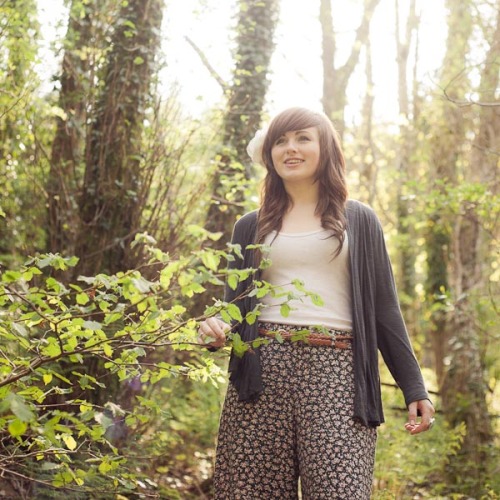
Wonderland: Creative Catalyst 19, ISO 200, 28mm, 1/200 sec, F18.

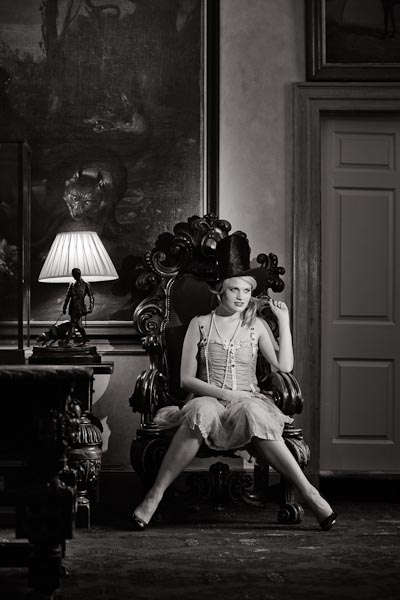
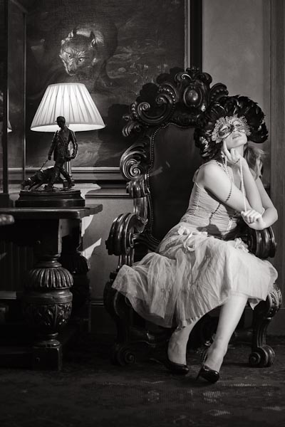
Matt Kloskowski’s Sin City - Light Red Preset: ISO 200, 35mm, 1/200 sec, F18.

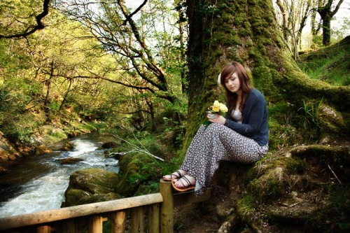
Wonderland: Creative Catalyst 09, ISO 200, 45mm, 1/200 sec, F18.

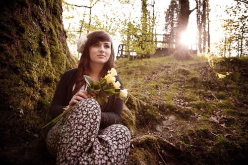
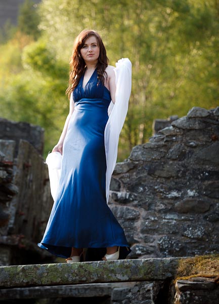
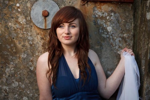
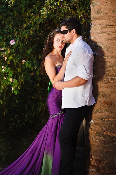
Matt Kloskowski’s 300 Look - Strong: ISO 400, 67mm, 1/125 sec, F8.

Wonderland : Creative Catalyst 11, ISO 400, 24mm, 1/100 sec, F11.

Wonderland : Creative Catalyst 14, ISO 400, 24mm, 1/125 sec, F11.

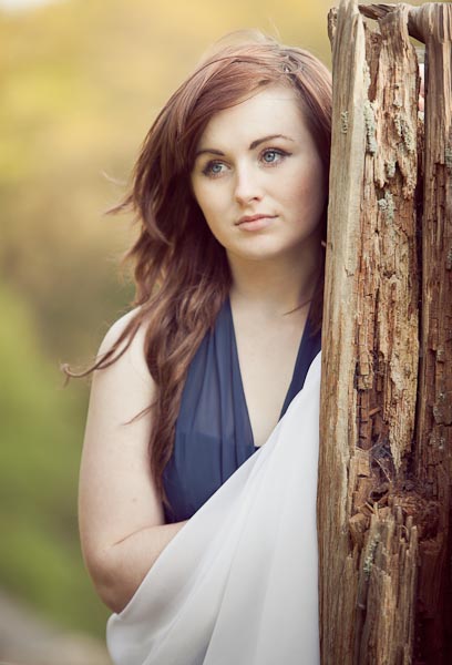
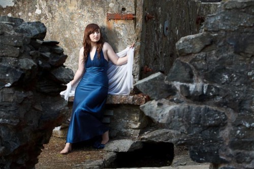
Wonderland : Creative Catalyst 58, ISO 400, 32mm, 1/125 sec, F8.

Matt Kloskowski’s 'Sin City - Light Red' preset, ISO 400, 58mm, 1/125 sec, F16.

There's no wacky preset used for this. I guess I just like this frame 🙂 ISO 400, 24mm, 1/125 sec, F16.

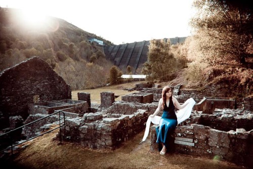
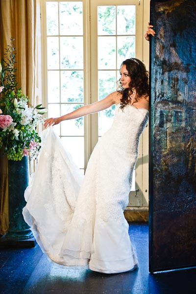
Wonderland : Creative Catalyst 15, ISO 640, 200mm, 1/200 sec, F2.8.

Wonderland : Creative Catalyst 19, ISO 200, 50mm, 1/160 sec, F18.

Wonderland : Creative Catalyst 30, ISO 200, 70mm, 1/1600 sec, F2.8.

Wonderland : Creative Catalyst 19, ISO 200, 195mm, 1/200 sec, F5.

Wonderland : Creative Catalyst 29, ISO 200, 50mm, 1/1000 sec, F4.

Wonderland : Creative Catalyst 26, ISO 200, 1650mm, 1/250 sec, F2.8.

Wonderland : Creative Catalyst 29, ISO 200, 24mm, 1/1600 sec, F4.

Wonderland : Creative Catalyst 32, ISO 200, 35mm, 1/1600 sec, F4. Added a blue gradient in Lightroom.

Wonderland : Creative Catalyst 51, ISO 1250, 105mm, 1/30 sec, F16.

Wonderland : Creative Catalyst 51, ISO 800, 24mm, 1/125 sec, F8.

Wonderland : Creative Catalyst 51, ISO 200, 24mm, 1/125 sec, F8.

Wonderland : Creative Catalyst 19, ISO 200, 24mm, 1/1000 sec, F4.

Wonderland : Creative Catalyst 19, ISO 200, 105mm, 1/500 sec, F4.
Read Full Post »

